The Potrero View
“How do we design for continuity?”
—Duration: 4 months
—Scope: Editorial Design, Identity Expansion
—Tools: InDesign, Figma, Illustrator, Photoshop
—Credits: TBD*CCA & The Potrero View
Lucie Tran & Finn Banbury
Instructor: Eric Heiman
Illustration: Chloe deBruyn Kops
The Potrero View is San Francisco’s longest-running neighborhood newspaper, documenting life on Potrero Hill and surrounding communities since 1970. For its 55th anniversary, the View partnered with TBD* to rethink its editorial design system, expanding the paper to evolve over time while remaining familiar and deeply rooted in its community.
Approaching the project as a system redesign rather than a one-off issue, we developed a flexible framework for a repeating publication. A more adaptable 12-column grid, clarified typographic hierarchy, and modular layout elements allow stories to flow across pages while accommodating ads and long-standing production constraints. Beyond print, we extended the View’s identity through Po, the Potrero Hill mascot, creating physical touchpoints that reinforce the newspaper as a living presence in the neighborhood.
Process
Research
Our first step to the project was researching the Potrero View not as a newspaper but an identity rooted in the neighborhood. Through conversations with stakeholders and field research, we came to understand that the View is doing much more important thing than delivering news, it brings connection, a sense of belonging, and foster the community. It connects the past, present, and future moments of the place.
Our challenge was not to reinvent the paper, but to sustain and strengthen the View’s mission by connecting with a new, younger audience while remaining familiar to long-time readers.
Initial Direction & Expansion
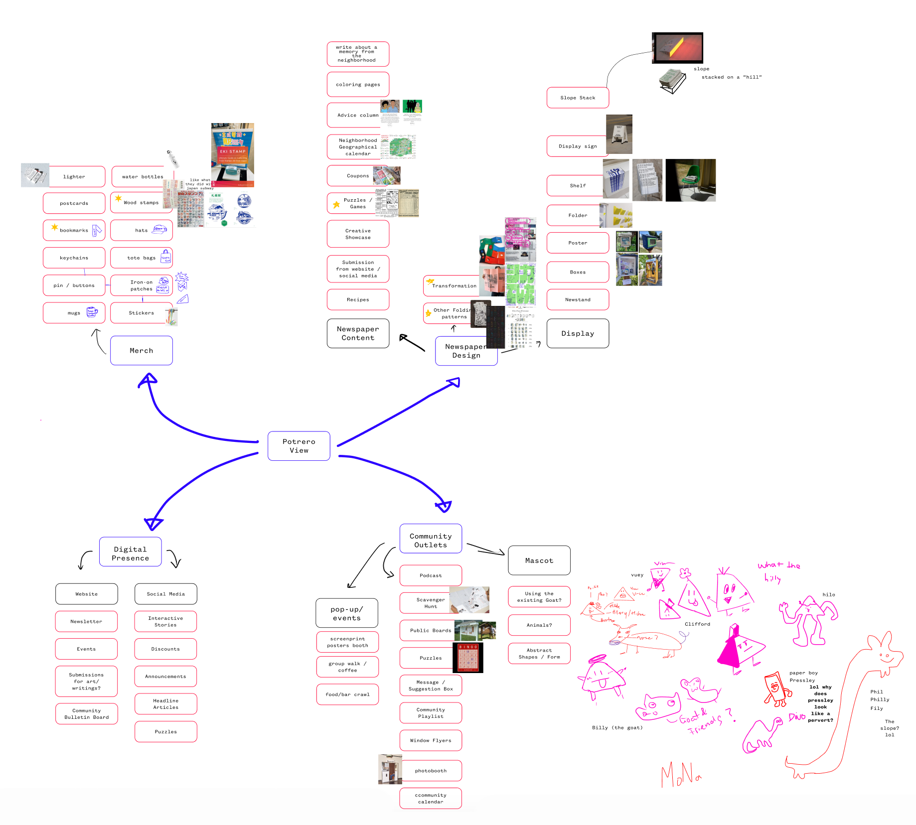
We began by expanding outward. Rather than limiting to the newspaper, we imagined the Potrero View as a broader ecosystem of touchpoints: physical, digital, and social. Alongside exploring different forms: merchandise, events, and interactive content, we also considered how these elements could unfold over a five-year timeline.
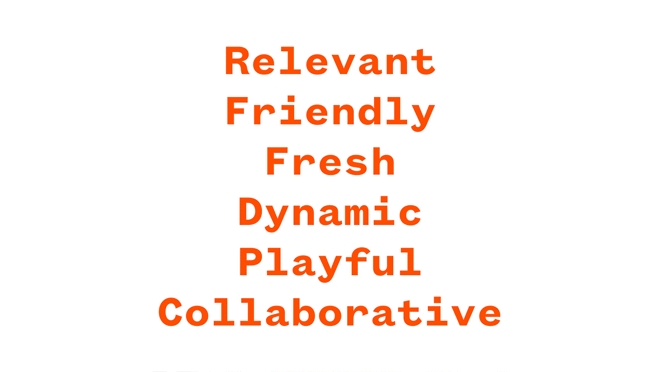
At its core, the View exists to connect people, and we wanted to understand how that connection could live beyond printed words. This phase was intentionally expansive and messy. By allowing every possibility onto the table, we clarified that the presence of the View's identity was what mattered the most.
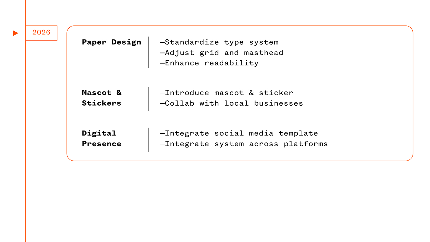
Final System
In the end, each of our decision prioritized usefulness over novelty. The system was designed to adapt issue after issue, responding to shifting content while maintaining a stable visual rhythm readers could rely on.
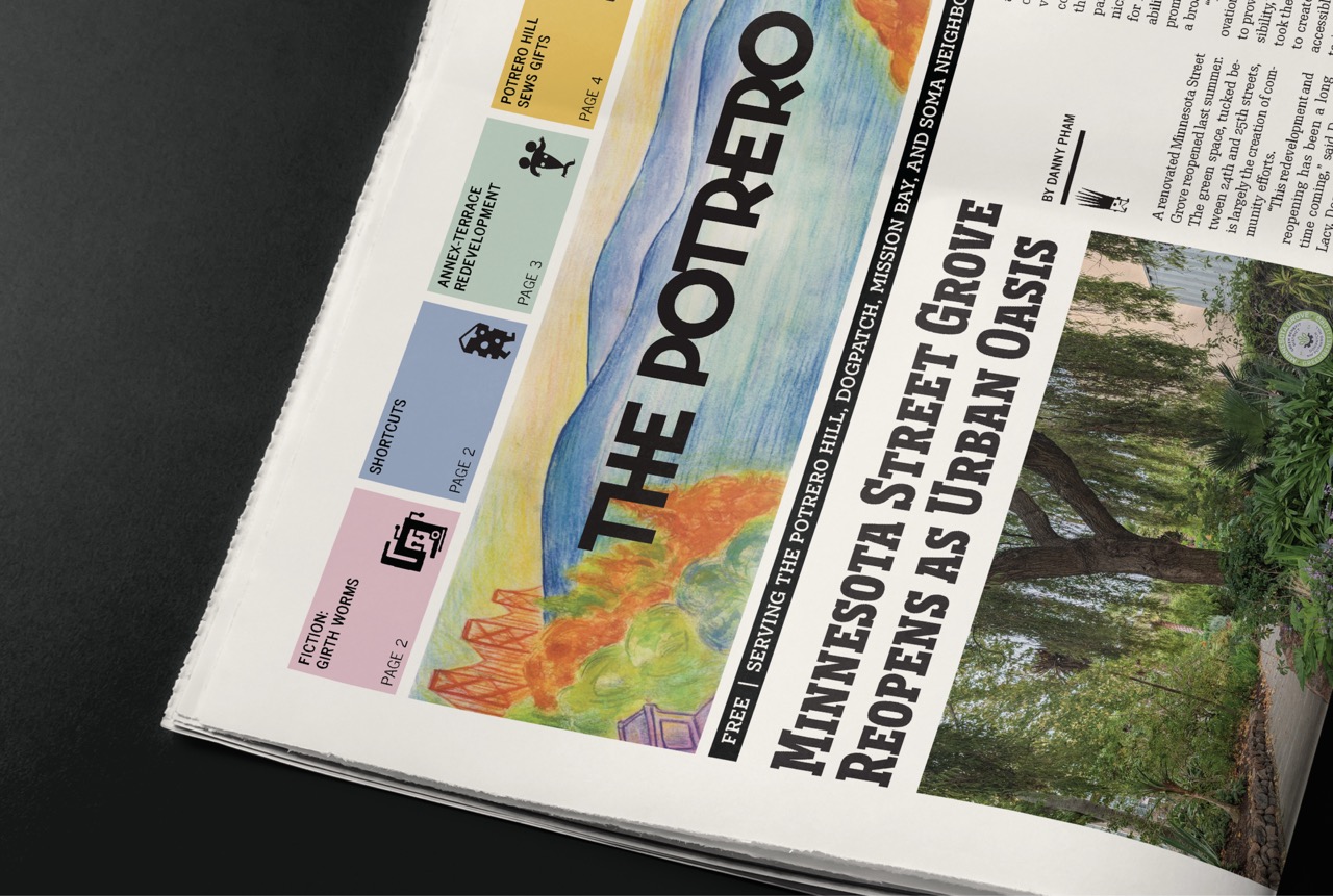
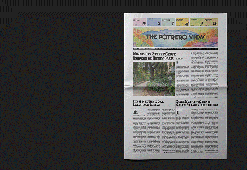
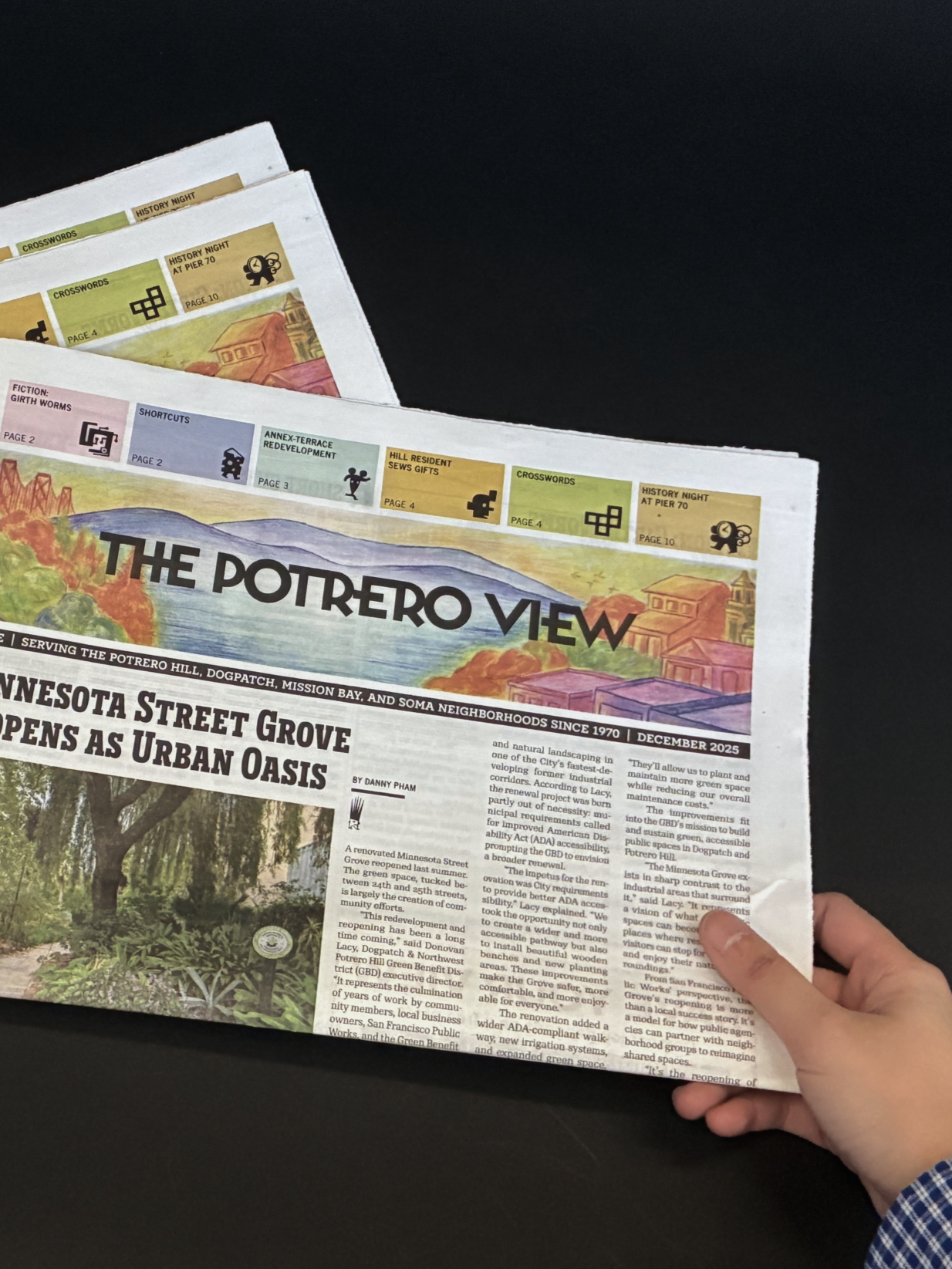
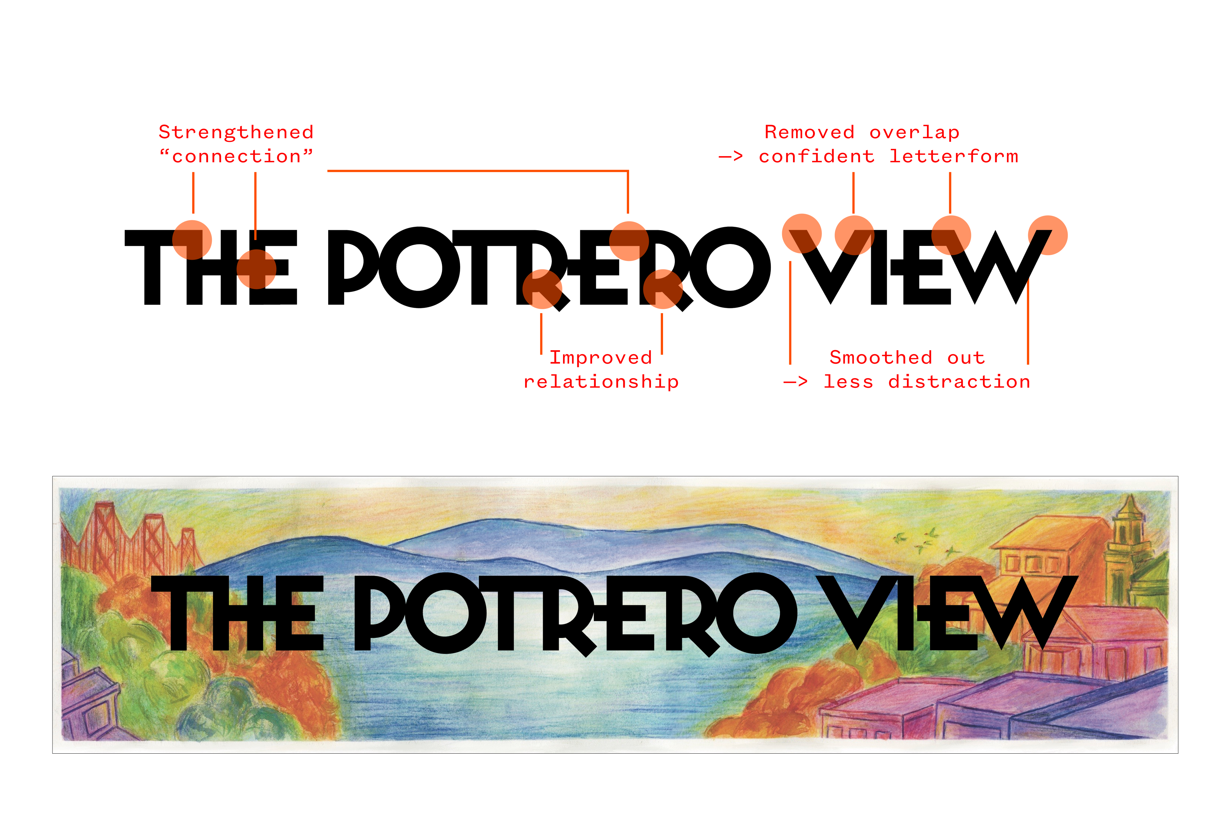
Masthead
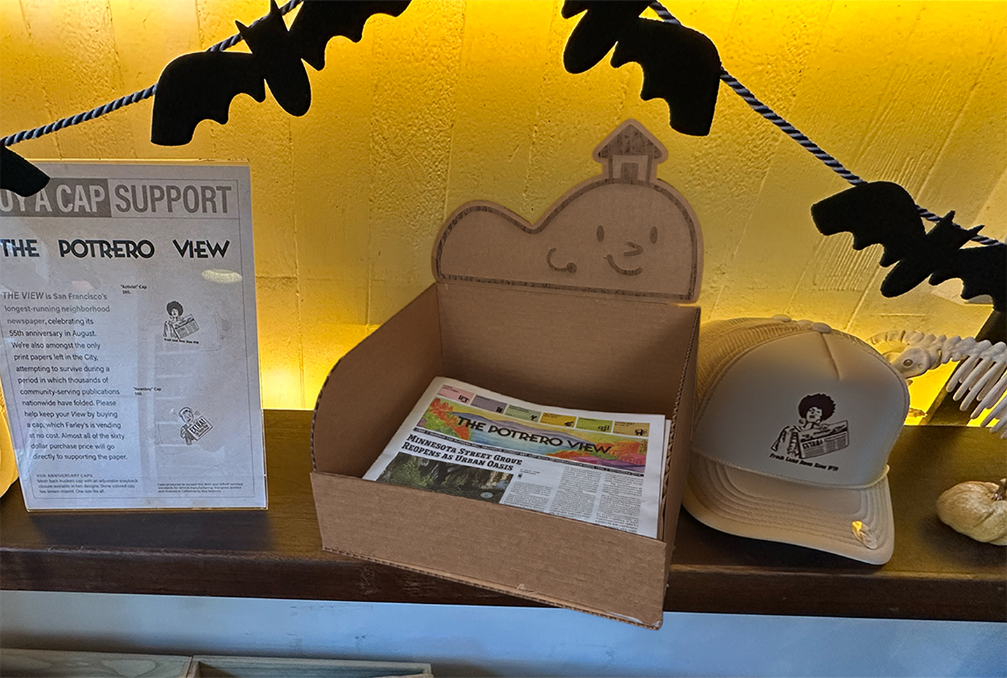
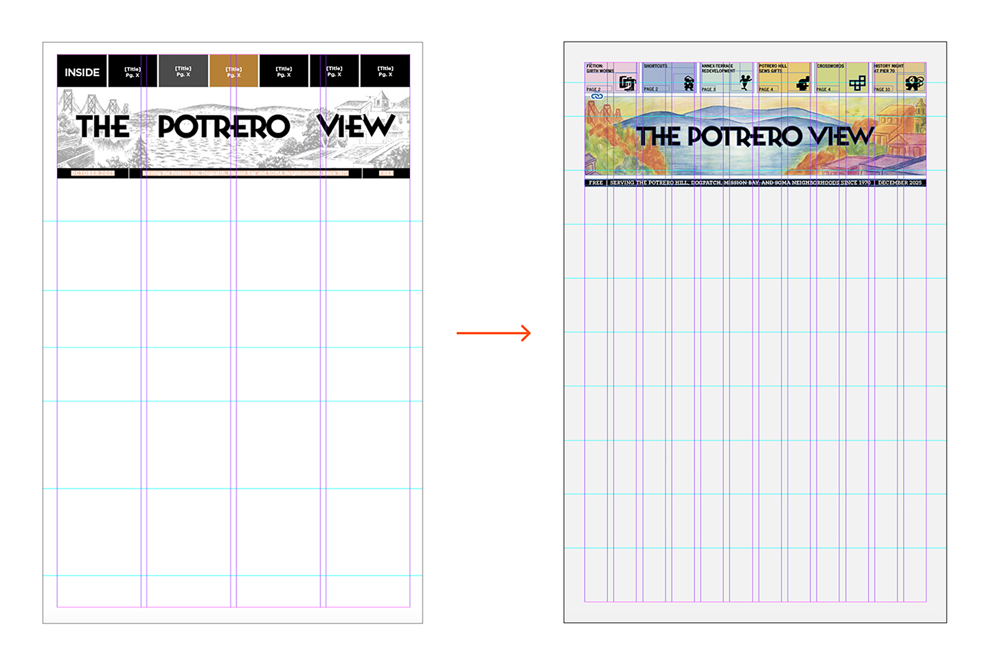
Rather than replacing the recognizable symbol, we refined it. The masthead was digitized and redrawn, preserving its character while updating its form and color for consistency across print and digital contexts.
Grid
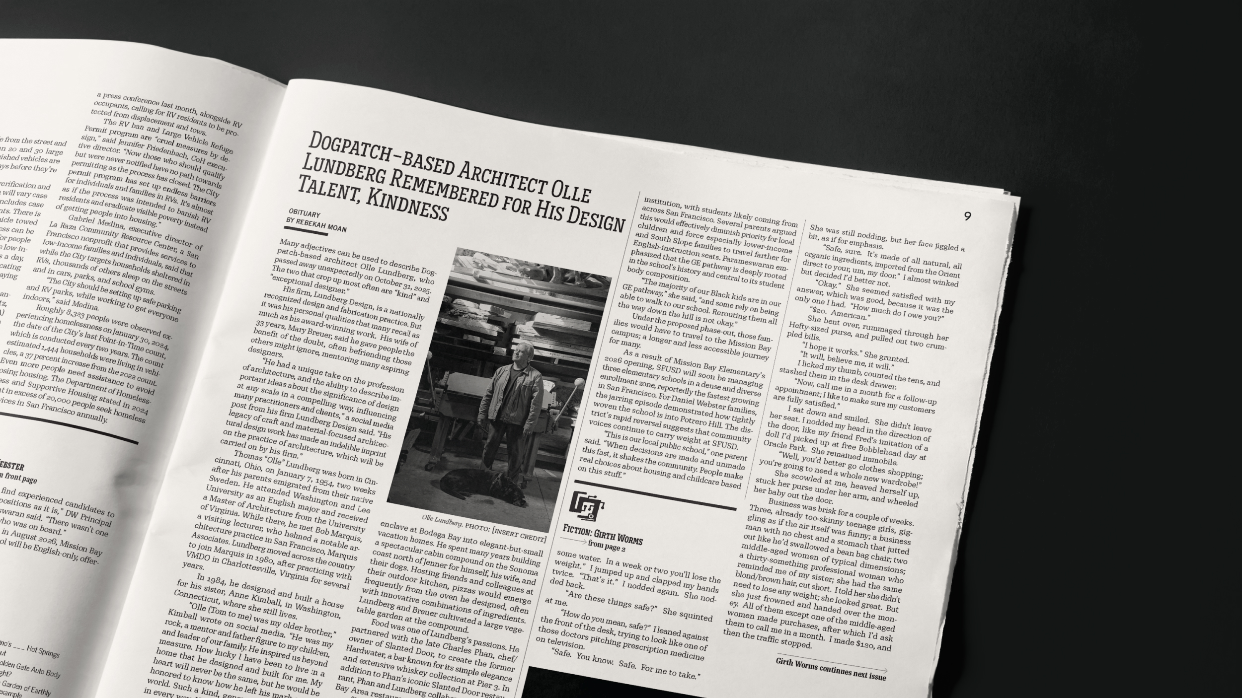
The existing four-column structure was retained but subdivided into a flexible twelve-column system. This allowed text blocks to be more flexible while accommodating ads and long-standing production constraints, crucial for a repeating publication.
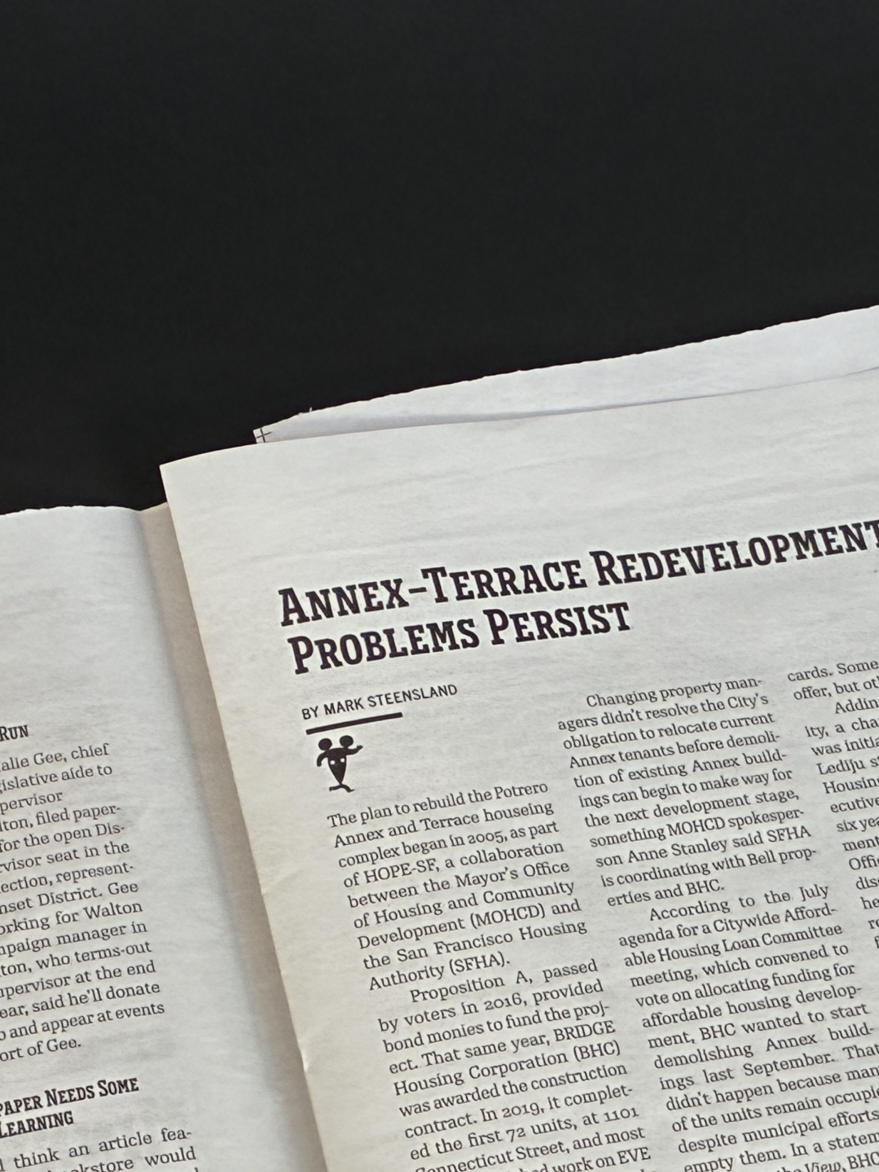
Type
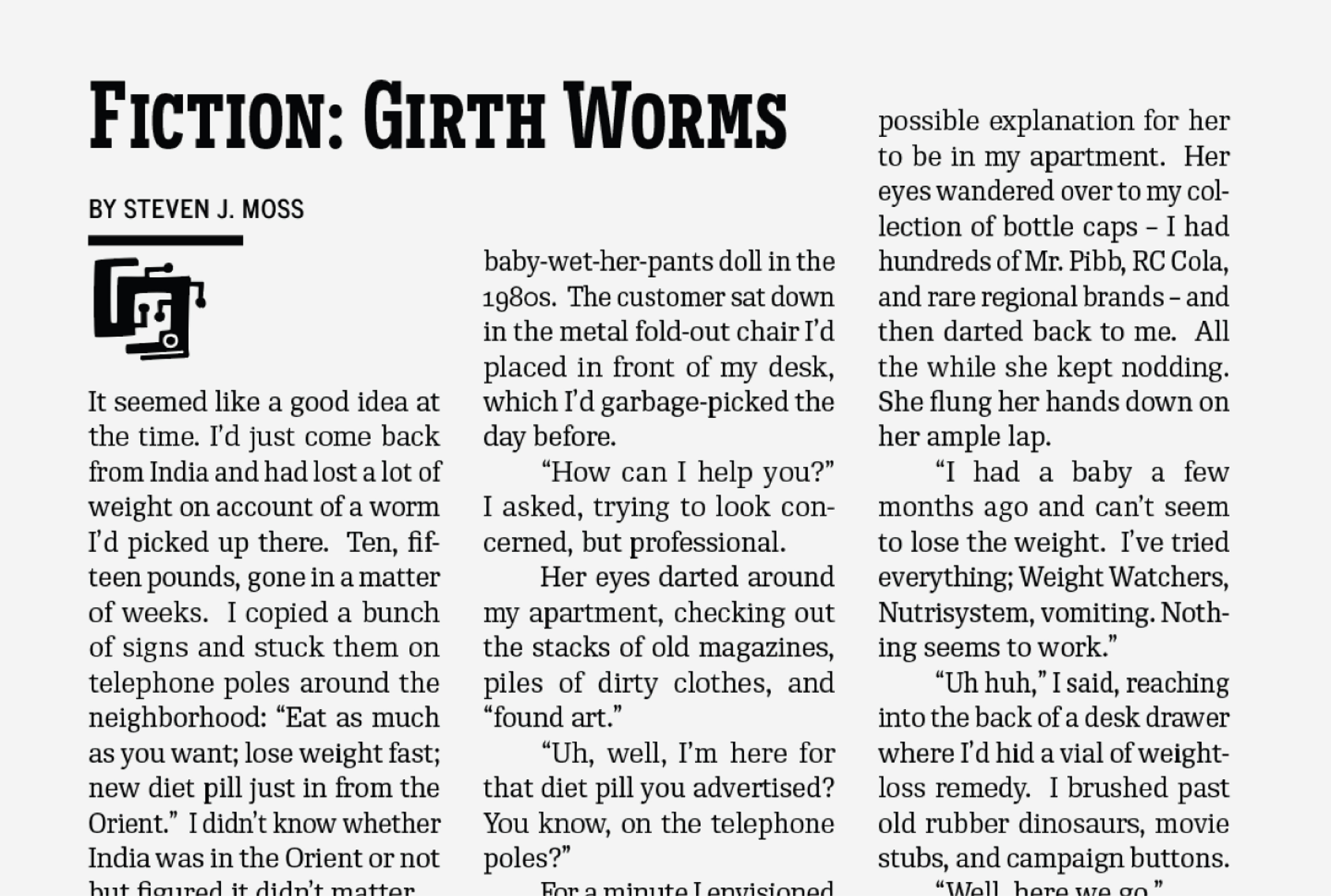
We clarified typographic hierarchy to support readability. A new text face with a higher x-height improved legibility, while condensed proportions honored the tight space of the paper. Dingbats were introduced as navigational cues, adding personality without overwhelming content.
Identity Expansion: Mascot
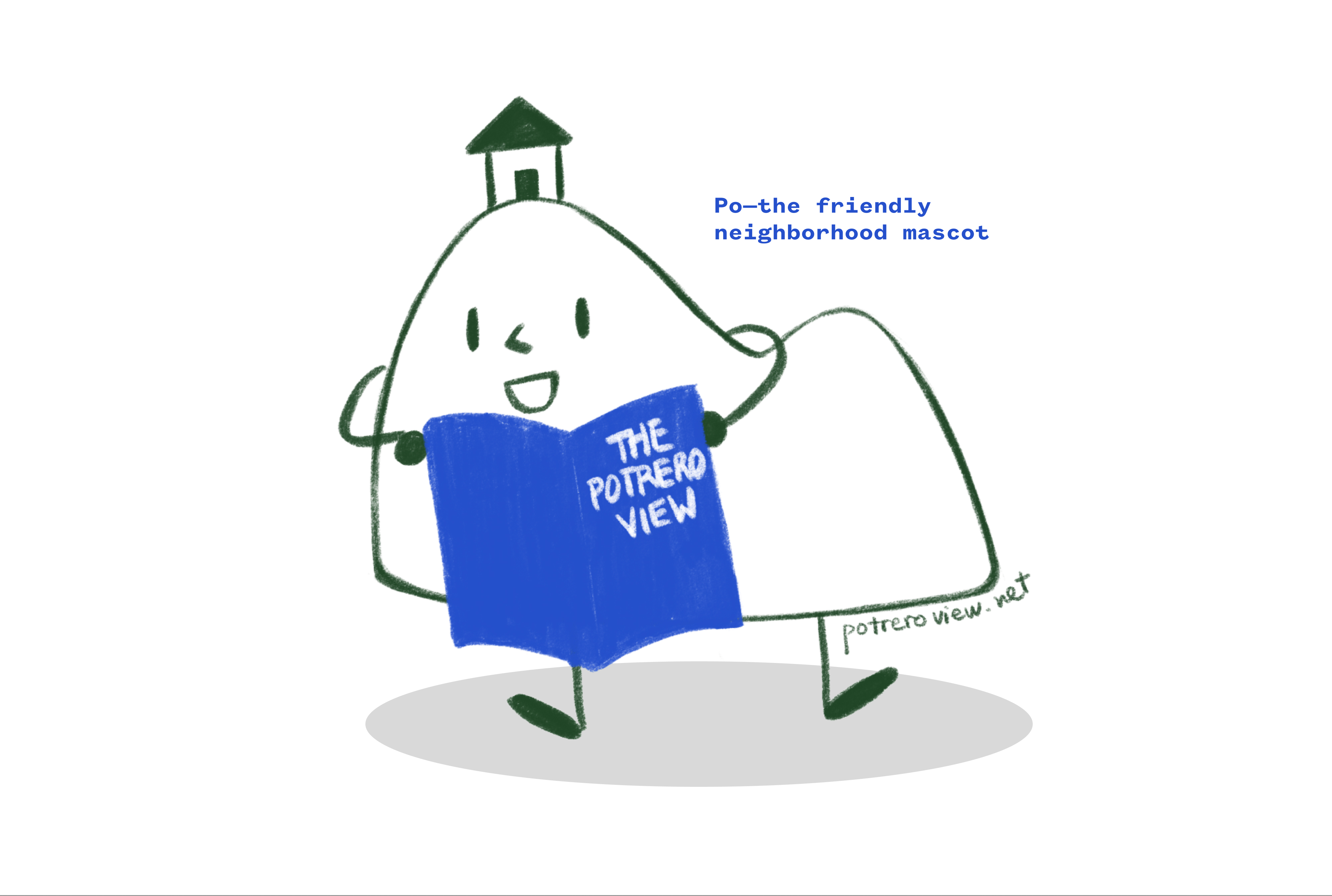
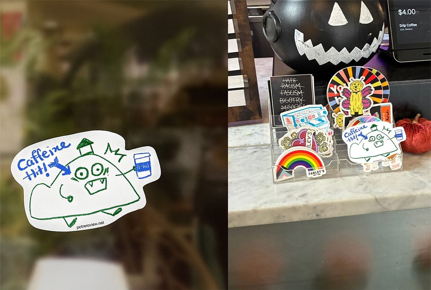
The final layer of expansion came through Po, the official Potrero Hill mascot. Designed to carry the paper’s values beyond the page, Po appears in small physical touchpoints: stickers, display boxes, and neighborhood moments, extending the View’s presence through warmth, humor, and approachability.

The Potrero View
“How do we design for continuity?”
—Duration: 4 months
—Scope: Editorial Design, Identity Expansion
—Tools: InDesign, Figma, Illustrator, Photoshop
—Credits: TBD*CCA & The Potrero View
Lucie Tran & Finn Banbury
Instructor: Eric Heiman
Illustration: Chloe deBruyn Kops
The Potrero View is San Francisco’s longest-running neighborhood newspaper, documenting life on Potrero Hill and surrounding communities since 1970. For its 55th anniversary, the View partnered with TBD* to rethink its editorial design system, expanding the paper to evolve over time while remaining familiar and deeply rooted in its community.
Approaching the project as a system redesign rather than a one-off issue, we developed a flexible framework for a repeating publication. A more adaptable 12-column grid, clarified typographic hierarchy, and modular layout elements allow stories to flow across pages while accommodating ads and long-standing production constraints. Beyond print, we extended the View’s identity through Po, the Potrero Hill mascot, creating physical touchpoints that reinforce the newspaper as a living presence in the neighborhood.
Process
Research
Our first step to the project was researching the Potrero View not as a newspaper but an identity rooted in the neighborhood. Through conversations with stakeholders and field research, we came to understand that the View is doing much more important thing than delivering news, it brings connection, a sense of belonging, and foster the community. It connects the past, present, and future moments of the place.
Our challenge was not to reinvent the paper, but to sustain and strengthen the View’s mission by connecting with a new, younger audience while remaining familiar to long-time readers.
Initial Direction & Expansion
We began by expanding outward. Rather than limiting to the newspaper, we imagined the Potrero View as a broader ecosystem of touchpoints: physical, digital, and social. Alongside exploring different forms: merchandise, events, and interactive content, we also considered how these elements could unfold over a five-year timeline.
At its core, the View exists to connect people, and we wanted to understand how that connection could live beyond printed words. This phase was intentionally expansive and messy. By allowing every possibility onto the table, we clarified that the presence of the View's identity was what mattered the most.
Final System
In the end, each of our decision prioritized usefulness over novelty. The system was designed to adapt issue after issue, responding to shifting content while maintaining a stable visual rhythm readers could rely on.
Masthead
Rather than replacing the recognizable symbol, we refined it. The masthead was digitized and redrawn, preserving its character while updating its form and color for consistency across print and digital contexts.
Grid
The existing four-column structure was retained but subdivided into a flexible twelve-column system. This allowed text blocks to be more flexible while accommodating ads and long-standing production constraints, crucial for a repeating publication.
Type
We clarified typographic hierarchy to support readability. A new text face with a higher x-height improved legibility, while condensed proportions honored the tight space of the paper. Dingbats were introduced as navigational cues, adding personality without overwhelming content.
Identity Expansion: Mascot
The final layer of expansion came through Po, the official Potrero Hill mascot. Designed to carry the paper’s values beyond the page, Po appears in small physical touchpoints: stickers, display boxes, and neighborhood moments, extending the View’s presence through warmth, humor, and approachability.